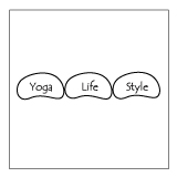
The Yoga Life Style Logo
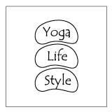
 Though I have thought of changing it over the years, I really love the Yoga Life Style logo and what it means to me. Way back at the beginning of Yoga Life Style as a business YogaLifeStyle.com was my personal website for posting info about free yoga classes I was putting on and later for paid classes and workshops. I liked having my email address be ray@yogalifestyle.com but I had no idea what would grow under that domain name.
A series of happy accidents led me to start selling yoga posters from this web location, and then yoga books and later yoga jewelry and gear and whatever I came across that I thought was valuable to this community. People seemed to like it and I kept adding things to the site. Somewhere in there, I realized I was creating a brand, I had letters to write, needed a bank account and business cards and to be taken seriously, a logo.
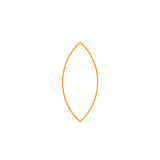
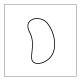
Like most things at the time, I meditated on this need and the idea of 3 things: ” Yoga, Life, and Style” being embodied on the site really appealed to me. Yoga as a way of life. Enhancing life through yoga. Having a style that announced you’re striving to be a peaceful, gentle soul. Yoga Life Style. Each one a seed from which new growth could begin. Well, actually they started as beans. I was raw vegan at the time and had a lot of beans around but working with a bean shape was not satisfying the inner neat freak in me and in time I came up with the ovoid tapered seed shape that also looks like an eye when on its side. I played with this shape alone and in 3’s for days.
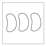
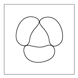
There was something I really liked about the three beans/seeds stuck together. I tried them end to end, stacked, side to side, in triangles and all sorts of variations. I was struggling since I wanted it to be compact and unique and interesting, while also being simple graphically. Side by side they looked like a world map and too corporate! Stacked they looked like three eyes, which was a little too trippy for what I was trying for. And then on an impulse, I overlaid those two and was gobsmacked. They formed a perfect circle. And suddenly the lines were all intersecting and all sorts of shapes were forming and receding. It was more than a logo it was a mandala. A simple geometric form constant and yet ever-changing. At heart, it is the three seeds and doubled it is an infinite array of patterns for the observer to enjoy. I still love gazing at my logo and seeing what emerges. I hope you do too!